When Should We Rebrand? 4 Things to Look For.
Many businesses operate in niche markets or complex industries.
Most of the energy of your communication and messaging work is focused on communicating technical specifications and product information.
And in some cases, the product itself CAN be the brand.
If your product is simple yet durable, then your company hopes that those product characteristics build a brand that feels simple and durable.
While product branding can add tremendous marketing value, this post will discuss company branding as a whole.
Many companies have a brand (logo, design, colors, fonts, key messaging, position) that was developed many years ago. In some cases, that brand still represents their values in the modern marketplace.
In other cases, that brand no longer resonates.
Your messaging may not be inspiring your audience to connect with you at a deeper level. Your products and services may have developed beyond what your brand was set out to represent. Or the aesthetic may simply be outdated.
We work with many clients on web design, digital marketing, and lead generation. Sometimes we recommend a rebrand and many times we don’t.
Here are some of the main reason your company may consider rebranding:
#1 Audience Disconnect
Understanding and being able to speak to your audience is what makes a brand successful.
When your brand resonates with your audience, every part of your organization’s identify inspires those who are following you.
Your logo, product name, colors, fonts, images, videos, and key messaging speak to their goals and make them believe in your organization’s power to deliver a product, service, or experience that solves a challenge for them.
So what does audience disconnect look like?
Here are a few signs that your brand is not resonating with your audience. Take a look at your digital marketing channels and ask these questions.
- Is your audience engaging with your social media channels?
- Is your email marketing moving subscribers into purchasing decisions?
- Are you paying for advertisements that show little measurable results?
We get it; branding is difficult which is why so many companies don’t address or update their brand for many years, or sometimes, many decades.
Business may be steady which causes leaders to ignore an issue with audience disconnect. But having a brand that misses the mark creates a slow but powerful loss of brand momentum.
Existing customers may continue to buy from you; you may even be winning some new customers. Over time, however, these brands tend to lose market share to competitors who are successfully marketing their brand’s story.
A successful and relevant brand is designed with a crystal clear understanding of its audience’s challenges, goals, pain points, and values.
#2 Outdated Aesthetic
Some logos and brands age gracefully.
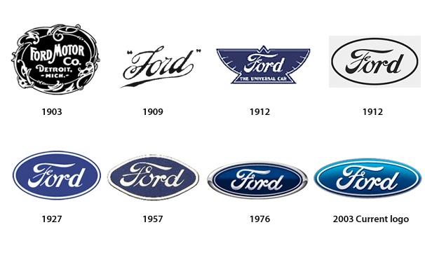
Look at Ford Motor Company.
Since 1927, the logo almost hasn’t changed at all. Sure there have been minor updates, but the aesthetic, overall design, and feel of the Ford logo has stood the test of time.
One of the reasons the Ford F150 consistently outsells the Chevy Silverado is the resonant message and brand: Built Ford Tough.
The Dennis Leary commercials, blue collar grit, hard work ads, messaging and style speak loudly to the pickup truck buyers of America (and around the world).
Decades later, the Ford brand still represents hard work and functional durability.
BMW is another example.
Since 1917, the logo still has the 3 letters on a circle with the white and blue circle in the middle.
It’s recognizable, and has always represented ingenuity and elite class.
But many more companies have had many more logo changes.
The Starbucks logo, for example, has always centered around the mermaid, but the colors, wording, and style have changed dramatically. These changes leverage the old design while keeping the design fresh and modern, ensuring the brand lasts for the long term.
Updating an Old Logo
Updating an old logo is one of the main reasons companies choose to rebrand.
Their brand and identity were modern and beautiful…
…in the 1980s.
But now it feels old and clunky and makes the company itself feel old and clunky. An updated brand can change brand, product, and even employee perception almost overnight.
A great way to find out if your brand feels outdated to your customers (and something most marketers ignore) is to collect customer data in the form of surveys.
Customers are usually happy to help your business with a quick survey.
Your survey could use multiple choice and either/or questions to ask what values your brand represents. It can also ask what your company stands for, what your products are known for, and what strengths and weaknesses your brand may represent.
This type of primary research can inform leadership and marketing teams of when a brand is starting to get worn out and no longer represent the kinds of things it was designed to represent.
Note: A logo redesign doesn’t mean losing all equity in the past work and connections you’ve built between the brand and your customers. It means doing the necessary work to show your customers that just like them, you’ve grown and changed and kept up with the times, while still honoring the connection they have to your brand.
#3 Inconsistent with Values or Products
Today’s global marketplace would be unrecognizable to our society a few decades ago.
Companies have changed.
Their audiences have changed and so have their products and services. Products that were cutting edge yesterday are now obsolete or extinct. Companies that used to sell products in a specific arena, are now selling their products to new markets via channels that didn’t previously exist.
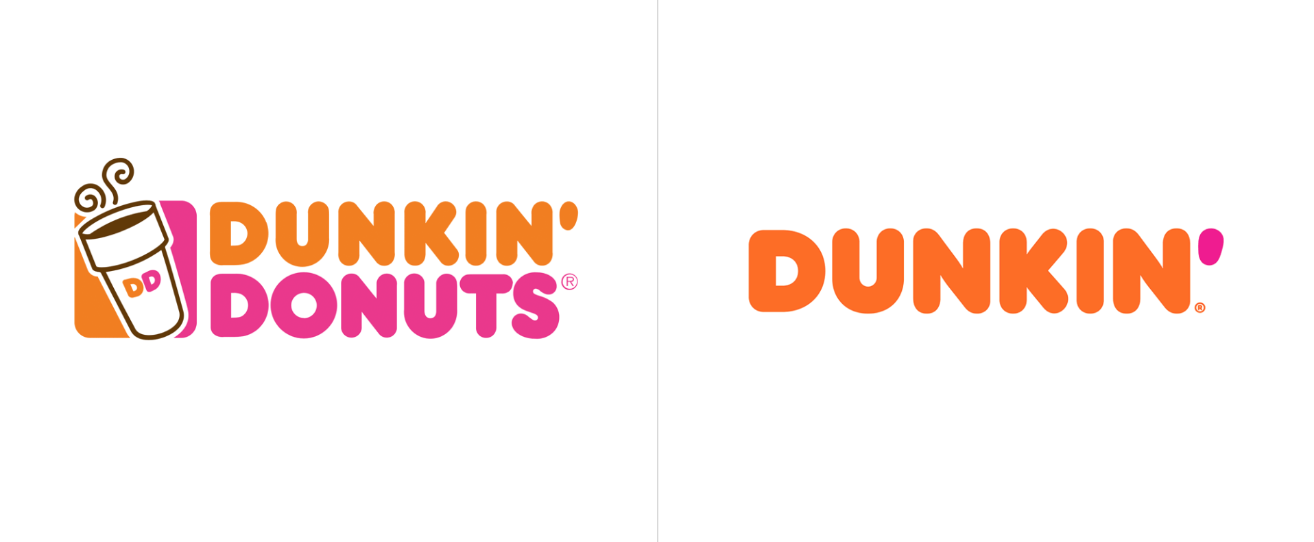
A recent example of this is Dunkin Donuts.
In 1948 they set out to be a donut restaurant and America LOVES donuts. From 1948-Present, they sold A LOT OF DONUTS.
But now they want to sell more than donuts. They removed “Donuts” from their name because their core products have evolved.
They now want to be recognized for selling great coffee fast to compete with other global coffee companies and the updated brand helps them do that.
Another example is Rock & Tait, a roofing company in Eau Claire, WI.
Their old logo correctly represented their core values of being a rugged and tough company that installs long lasting roofing products.
But Rock & Tait’s values evolved and now go further than that.
They approached a rebrand because they wanted their company to represent family values and convey the way their products protect families and the memories they create in their homes.
Their new brand is welcoming and also has themes of strength and durability, the same values their company holds.
#4 Difficult to Place in Modern Channels
Logos and brand materials have to be able to be placed in a massive number of channels and formats.
You used to place your ad on a t-shirt (screen printing), print ads (traditional printing), and other fabrics (embroidery).
Now ads need to have various colors, sizes, and file types to fit across different digital platforms, social networks, streaming services, and other dynamically generated placements.
One modern startup approached a rebrand even though their company was only 10 years old and was one of the fastest growing tech companies in the world.
Why?
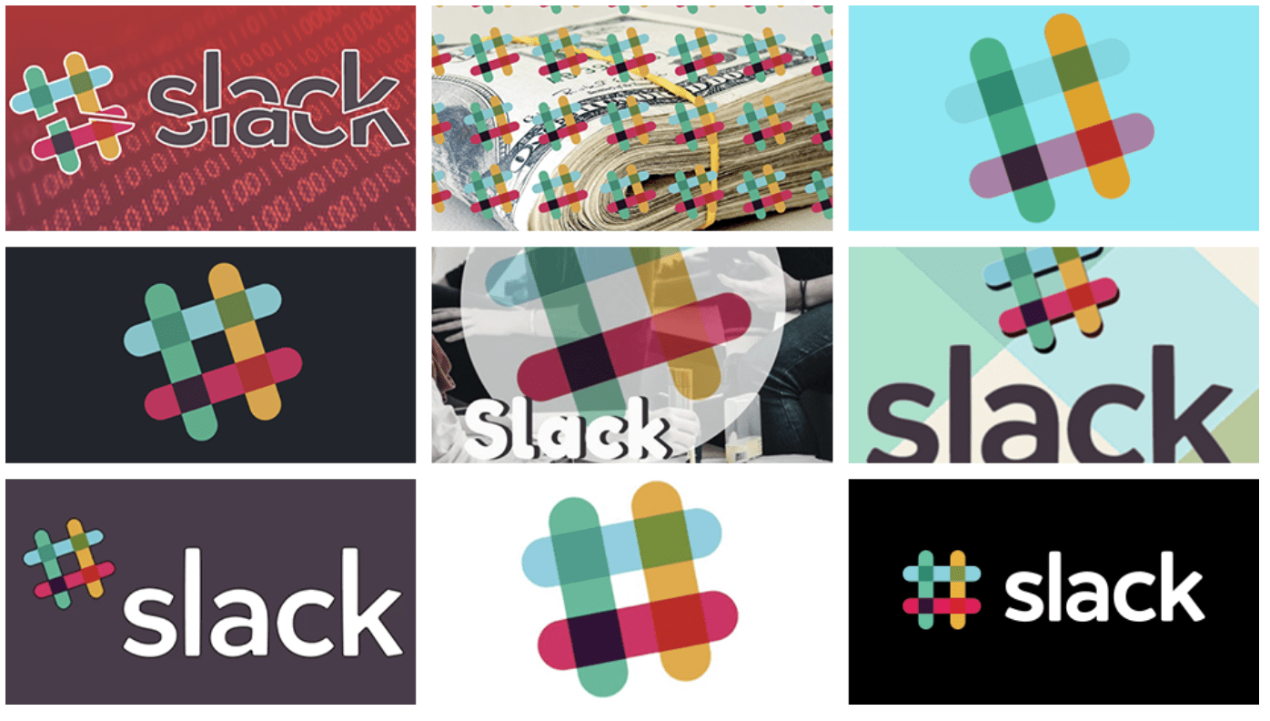
One main reason Slack (a workplace messaging and productivity app) rebranded was that their logo was difficult to place in different formats.
It was playful, it was trendy, it was tech-y.
But it had one big problem…
It had 11 different colors.
When placed on any color other than white, it looked funky. When placed on a textured background it looked funky. When it wasn’t at the correct 18-degree angle, it looked funky.
Today’s brands have heavy lifting to do because they need to work in a thousand different ways.
Slack’s brand didn’t do that, so they rebranded.
Here’s How to Start with a Rebrand
The #1 mistake that companies make when rebranding is being self-centered.
They build a brand around what feels important and inspiring to themselves.
That seems like a logical place to start but in reality it usually leads to more audience disconnect.
Start With Audience
Audience alignment is the foundation of successful rebrands.
Without an audience, there are no sales. It doesn’t matter how much you love your own brand; if it doesn’t resonate with your audience, you’re on track for negative growth.
Here are some questions to start with:
- What are their goals?
- What do they believe about themselves?
- What are their challenges?
- What causes them pain?
- How old are they?
- What are their hobbies?
- How much money do they make?
Every ounce of your rebrand should be built on this question: Who is your audience?
Your key messaging, logo, colors, fonts, etc. should all relate to who your audience is, what they desire, and how your brand offers the solution to their goals.
Let your audience profile inform the design, feeling, and messaging of your rebrand.
If you need help with a rebrand, we have several rebranding articles to guide your process.
Or if you just want to talk, we’d love to give you a free ideas call.
Happy branding!


Comments are closed.